Monday, August 15, 2011

52nd St - Done For Now


I think I'm done with the 52nd St Bar for now.


For this final render I was reminded of a couple obvious but important points. Don't be afraid to brighten things up, and you can always correct in post.

I'm sure eventually I'll tweak again, but onwards and upwards for now.

Thursday, August 4, 2011

I feel like this is finally getting closer to completion!


Tuesday, August 2, 2011

52nd St - 8/3

I have done quite a bit on this tonight! My main goals were to :

1) Create more contrast on the interior
2) Help the character in the doorway stand out with more light and color
3) Continue work on a 'mood'
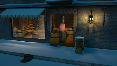


I got rid of some of the unnecessary elements of the scene3 I then moved the light closer to the character so as to light him better. Color was added to the character to help him stand out.

I also tried something interesting with the Occlusion pass. Typically Occlusion just darkens tight areas, but in this case I put a luminosity blending mode on the occlusion pass and merged it with the color beneath. This gave me a color tinted occlusion pass - with the occlusion being slightly blue on the outside and orange on the inside. I like the results of this!

Monday, August 1, 2011

52nd St Bar

Continuing work on the 52nd St Bar - I'm trying to make the interior more welcoming. Whereas before the lighting was more even, now I'm trying to break it up - create more texture and tone with the interior. It's not there yet, but getting better.


Thursday, July 21, 2011

FOX59 Wants to Know ...

I have been working on a new animation for FOX59 - which is FOX59 Wants to Know.


So far I am 3 days and about 32 hours into this. The 'set' is pure 3D, but the monitor contents and logo were added in post. I am planning on making the animation modifiable in After Effects so that the contents of the monitors and the logo can be changed on the fly by an artist. That'll go a long way towards making quick opens for news!


Wednesday, July 13, 2011

52nd Street Bar

A new CGTalk Lighting Challenge was released recently - so I've decided to give it a go :)


I like where it is starting. The light motivation and color is feeling good but I think I have a lot of tweaking of intensity to do.

Right now this shot has about 6 lights in it and no Global Illumination. I'm really going to play up the accented warm light on the exterior objects as I've started to do on the barrels to the right ... I think that will be key in this shot.

I also want to update quite a bit of the modeling. It would be great to add some more architectural details.

The biggest thing I need to work on is probably the lighting on the ground (snow) outside of the building. It feels very ... confusing.

More soon!

Friday, May 27, 2011

Art Studio Revision

I couldn't quite sit on this one, so I made a few more changes :)


1) The haze quality has been bumped up to get rid of the graininess and the overall haze has been softened

2) I brightened up the bounce light a bit and darkened the textures on the walls

3) I increased the rim lighting on some of the foreground objects

4) I brough down some of the lighting on the main subjects in the center

5) I added Ambient Occlusion to the overall image rather than doing it in post. My reason for this is the haze is difficult to composite in post due to its overall effect on lighting and the occlusion pass didn't look right layered on top. I tried tweaking the occlusion pass using a haze pass to dampen it down wherever the haze existed but it still wasn't quite right ... so doing it pre-render seems to work better for this case.